
Comprehensive USA Market review November-December 2021 part 1
Comprehensive USA Market review November-December 2021 part 1

In this article, we will explore in depth into the recent bout of volatility , from around 20 nov – 21 Dec in USA market, where S&P 500 retrace about 5% and Nasdaq 100 retrace about 7.5%.
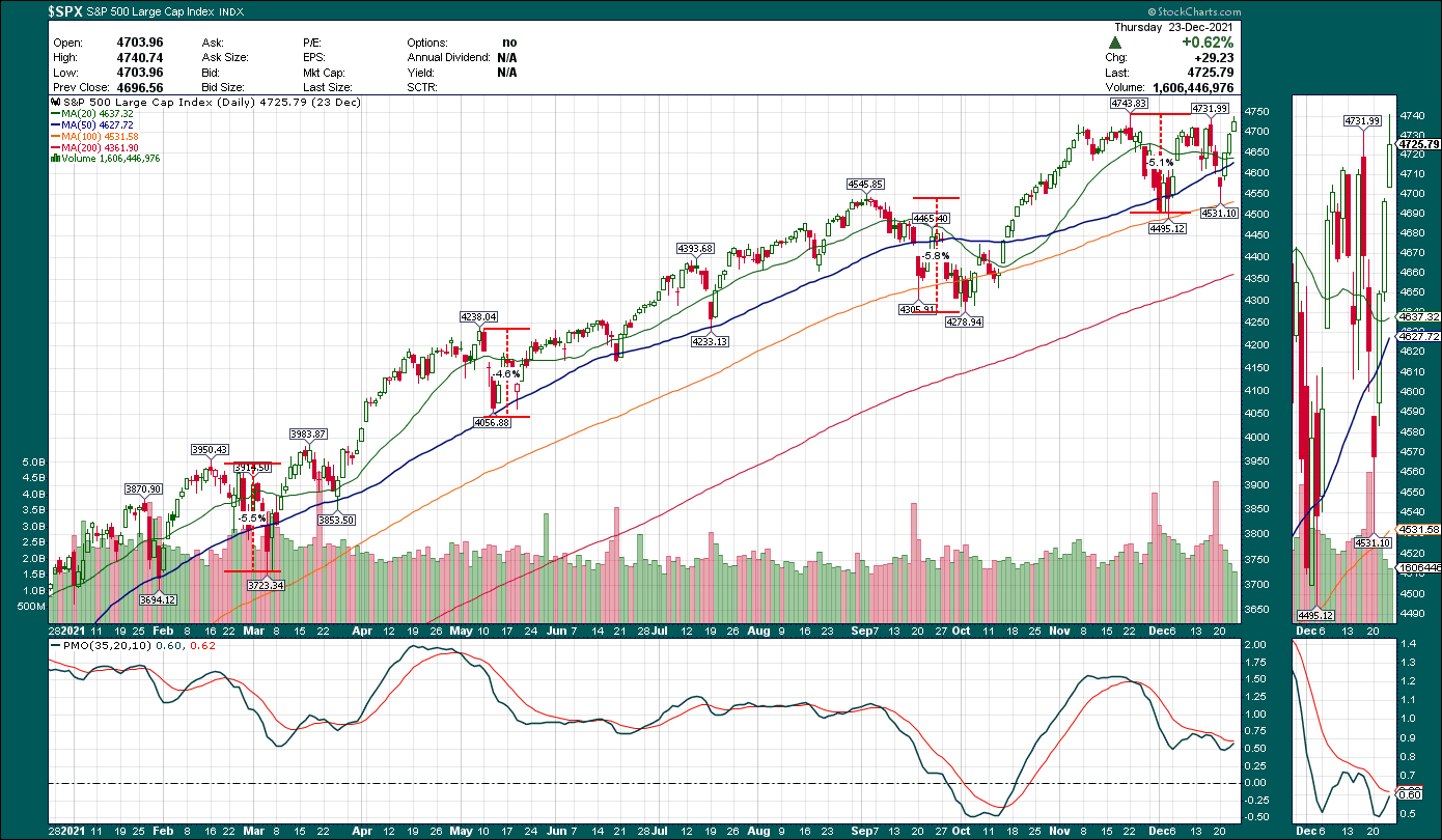
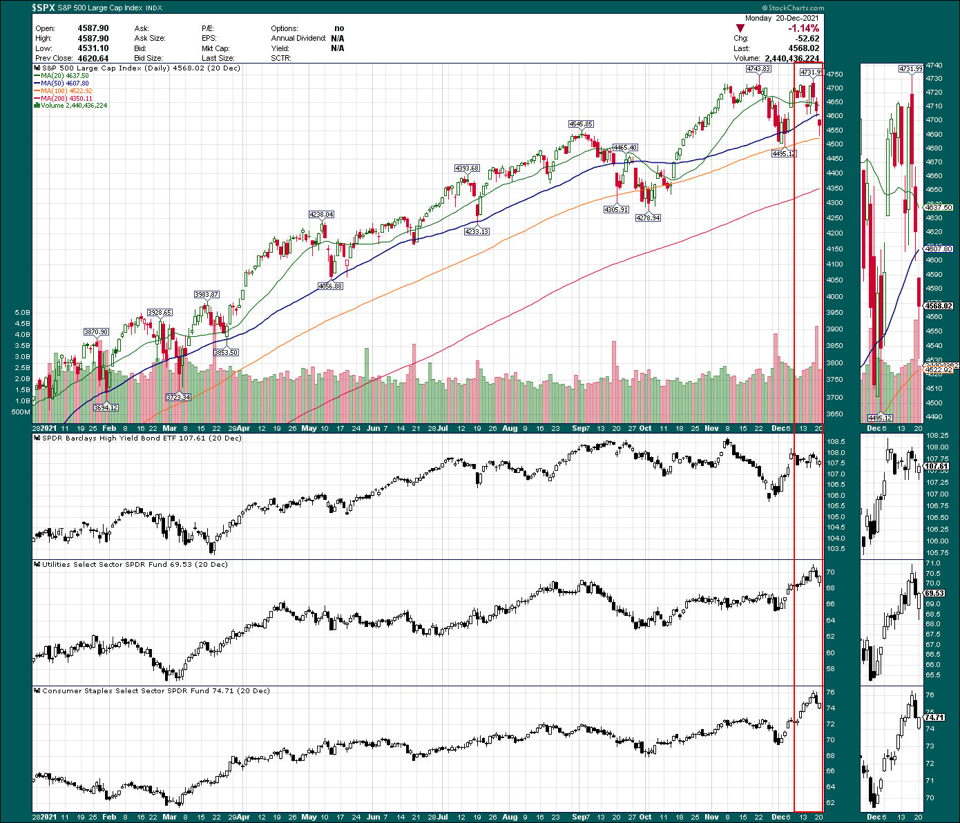
S&P500 ($SPX) chart

Nasdaq 100 ($NDX) chart
Why did Nasdaq retrace 50% more than S&P 500 ? because market is pricing in faster tapering and rate hike next year after Fed retire the transitory word in their inflation outlook. When rates are higher, most growth name are discounted by Institutional player through "discounted cash flow" model, e.g 3-5 years forecasts of cash flows are expressed in today's Money by discounting them via a market-based rate, therefore when rates rise, the present value of future cash flows is worth less, hurting growth stocks.
Ominously Nasdaq 100 was showing Head and shoulders pattern, visible in daily chart, but it’s more pronounce in hourly chart, as shown below
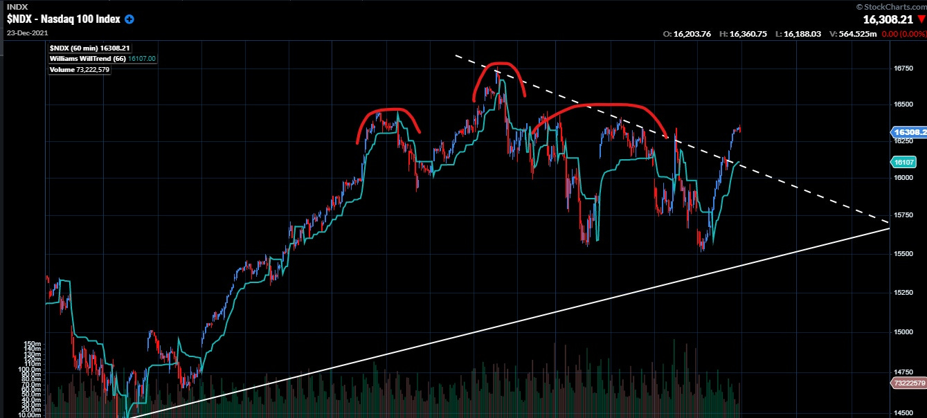
$NDX chart - Head and shoulder pattern
The recent fall in the indices, according to “Media”, was primarily attributed to,
1) Chairman Powell retired the “transitory” word in Congress testimony ( yes, strongly caused by this)
2) Omicron Variant ( Really !!!??? )
Other actual reason for the fall but not really highlighted by media,
1) Tax loss selling
2) Weakness in 1st half of December, seasonally speaking
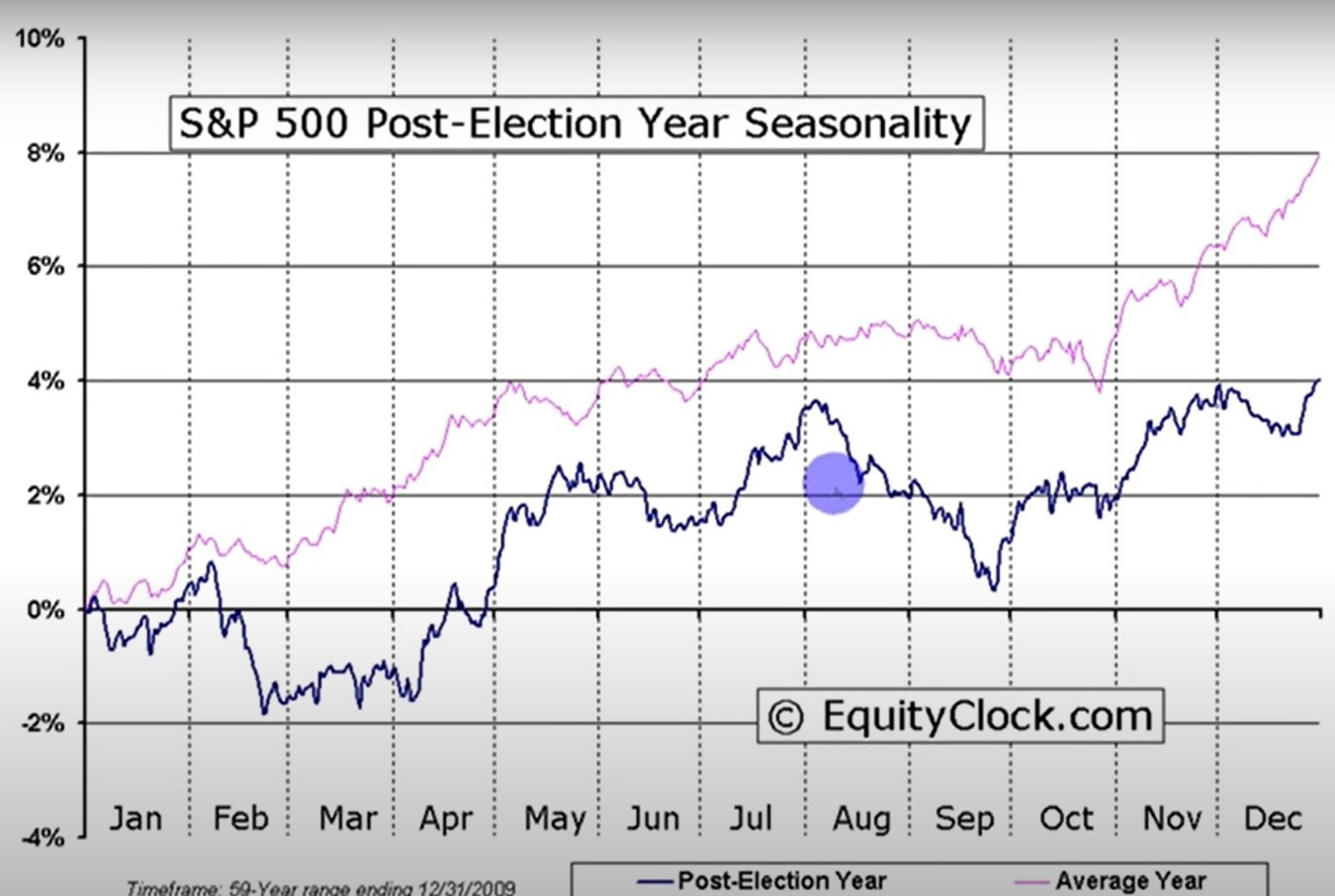
Seasonality chart , pls take a look at the blue line for post election year , where there is some weakness in 1st half of december.
As Chairman Powell retire the “transitory” word from inflation vocabulary, market start to price in faster tapering , earlier and more rate hike ( market expect a double increase in monthly tapering amount 15 billion to 30 billlion, which push 1 rate hike to march 2022, and a total of 3 rate hike ) 2 year Yield shot up, market went into risk off mode immediately, stock fall immediately.
There are other sign that this fall is something to be taken seriously, such as big increase in put buying ( especially compared to previous period within 2021 ). The drop in high yield bond ETF ( riskier bond are first to dump in signs of stress ), as well as the increase in ICE BofA US high yield index option-adjusted Spread, as shown in chart below
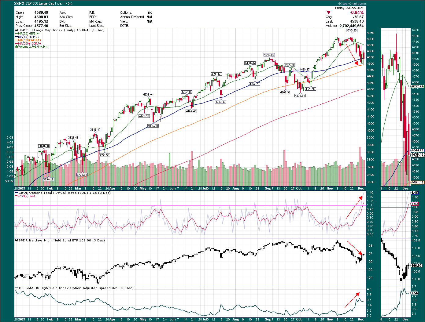
$SPX chart – 1st fall
Fast forward to 14 December 2021 - Fed meeting date, big player market positioning has been armed to the teeth with put option and index futures short, and they were expecting 30 billion tapering monthly with 3 rate hikes. And when fed decision outcome was within expectation, there were enormous coverback of their put options and index futures short, bringing SPX very close to All time high of 4700-ish level and Nasdaq 100 close to 16400 ish level
However, there was just one problem with this move, Defensive sector in S&P 500 were also rising, namely Utilities XLU and consumer staples XLP. Subsequently , S&P500 fall again to 4550ish level and Nasdaq 100 fall to 15550 ish level, as shown in chart below
$SPX chart – 2nd fall
Many financial players has been wondering where is Santa amidst all this chop and uncertainty, anxiously praying for the arrival of Santa and turn-around in fortune around Christmas period.
And true enough on 21st December, it appears that Santa did arrive with plenty of presents to save the day, with SPX close to ATH of 4700ish level again and NDX around 16300ish level
I was referring to the seasonality chart and was expecting a recovery move ( will elaborate more on seasonality in part 3 or part 4 of my review ). But it was nice to see a confluence of other factors confirming the seasonality expectation, as shown in chart below.
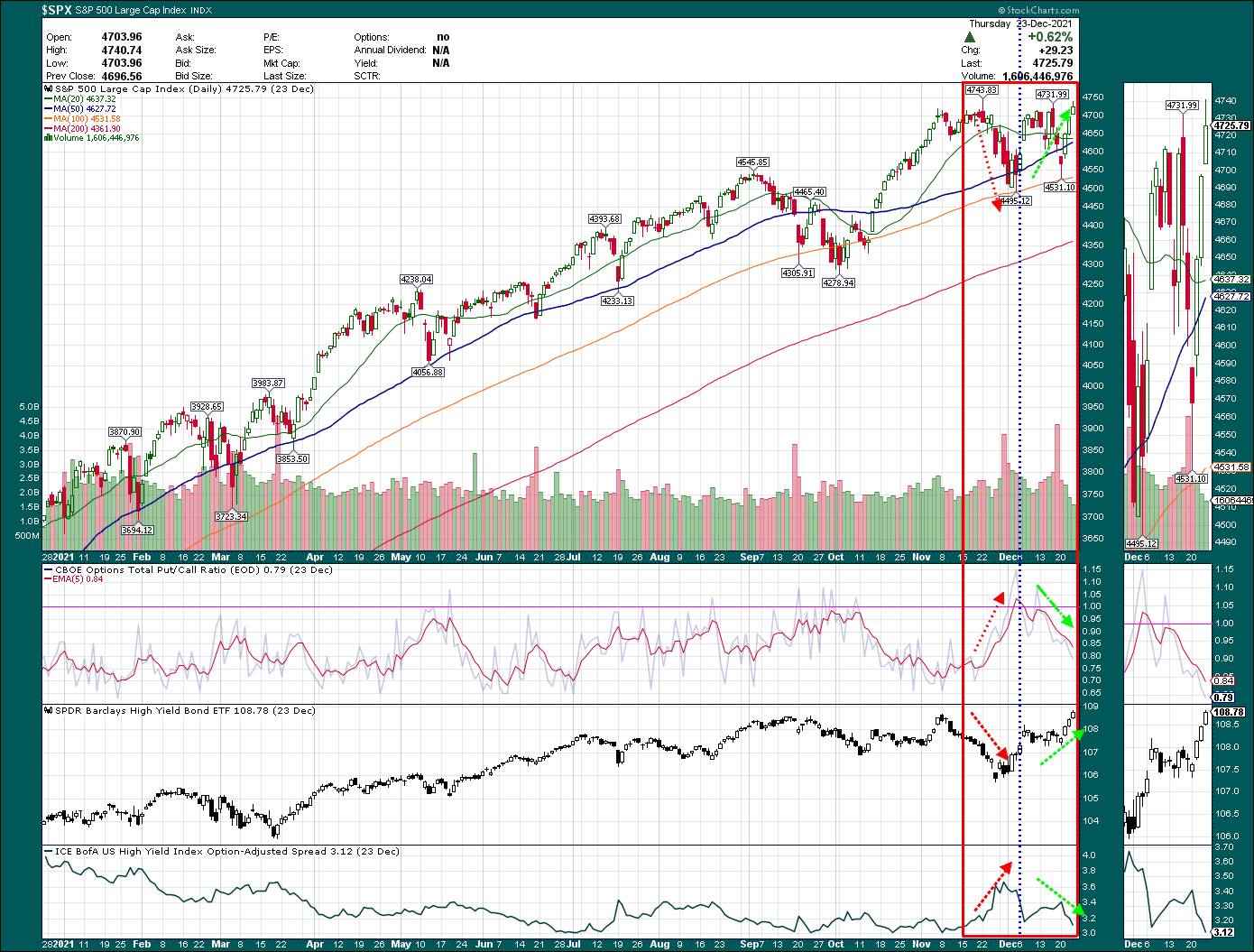
$SPX chart – Put call ratio, JNK, BofA HYI
In SPX chart, we see put call ratio and ICE BofA US high yield index option-adjusted Spread fall even further while Junk bond ETF didn’t fall at all in SPX and NDX 2nd fall.
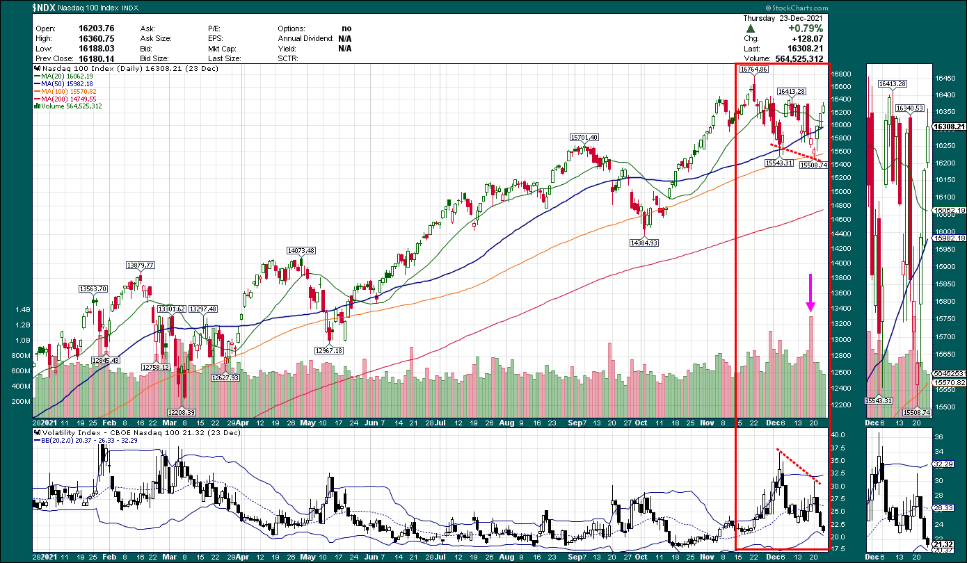
$NDX chart – VXN
even more notably in NDX chart, , “VIX” for NDX, which is VXN was making lower high while NDX was making a slightly lower low in 2nd fall.

$SPX chart - JNK XLU, XLP
In the days ahead, I will closely watch the above chart( JNK, XLU XLP), as long as Junk bond ETF keep going up and defensive sectors utilities, Consumer staples keep going down, we are poised to break all time high for SPX and revisit all time high for NDX.
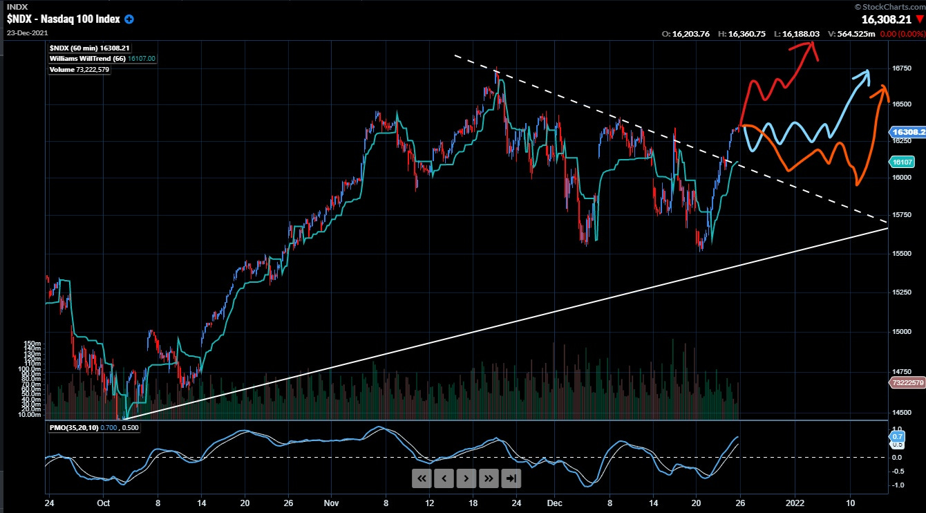
$NDX chart 3 possible path /scenario
And as long as assumption of Junk bond ETF going up, XLU, XLC decrease holds, one of this 3 scenario will play out for NDX ( represented by different color pen ).
In part 2 of my review, I will post other additional chart of co-incident indicator confirming the recovery of the market.
In part 3 & 4 of my review, I will be posting other seasonality chart and trade design as well as reviewing different entry method.
Disclaimer : The information presented here are for research and education purpose only, and does not constitute investment advice, trading recommendation, author shall not liable for any action taken by any individual/company with regards to the information presented here or any part of the website - https://figureoutmarket.substack.com/